Pillow Fights and Responsive Images
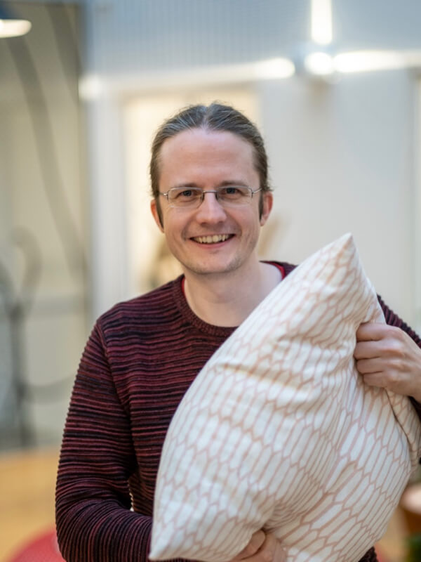 Is it a pillow fight, or are there darker undertones in this seemingly cheerful
picture? I don't have an answer for that, but here you'll get a neat trick for
creating truly responsive images.
Is it a pillow fight, or are there darker undertones in this seemingly cheerful
picture? I don't have an answer for that, but here you'll get a neat trick for
creating truly responsive images.
The Problem
It’s not always that a large portrait mode photo fits in properly (and by that, I mean the layout, not a grinning maniac about to smother you with a pillow). This is especially true when you need to account for everything from small mobile phones to the huge screen in the office.
Maybe if there’s enough space, you can display the whole image to the left, with the text on the right side, in such a layout:
So far, so good.
On a slightly narrower screen, maybe something like this would work?
At some point, we’ll have to switch to having the image above, and at that point it becomes absurd:
The image dominates the textual content. Also, there are limits to how much “Magnar with a pillow” we can handle at once. No, better then to go for such a layout:
So what’s a poor frontend developer to do? One thing’s for sure: We don’t want to make three versions of the image.
Toward a Solution
Good old <img> falls short here. We need to be able to adjust the crop size
independently of the content of the image itself. It has to be a <div>. Then
we slap the image on as a background-image, and well, see for yourself:
Okay, there’s certainly something decorative with just the upper left corner of the image, but it’s not quite what we envisioned.
Now see what happens when we add background-size: cover:
Excellent!
Not Quite Excellent
But what happens with the other two sizes we wanted?
Hmm…
Well…
It doesn’t quite work.
The Final Trick
To fully perfect this beauty, we can tell the browser where to focus. And we do
that with percentages and background-position:
background-image: url(/images/pillow.jpg);
background-size: cover;
background-position: 50% 25%;
Look at that, the face is right in the middle!
And here as well!
From Blog Post to Production
To be able to use deliciously responsive images like this (again, about how they’re laid out, not this particular pillow picture), we need a bit more metadata: the position of the focus point. It has to be included with the image, either in the CMS we use, or as metadata in the filename or something similar.
And then you end up with some HTML like this:
<div class="r-img"
     style="background-image: url(...);
            background-position: 50% 25%;">
</div>
It’s not a cute little <img> anymore, exactly, but oh so delightful to be able
to use the same image in a bunch of different views, right?
Update!
Thomas Østdahl here at the Food Safety Authority pointed out a trick to use
<img> after all:
<img src="..." style="object-fit: cover;
                      object-position: 50% 25%;">
Both these rules are widely supported in all browsers according to caniuse.com, so now we can create responsive images with an even clearer conscience. Thanks, Thomas!
A Final Thought
This technique asks you to consider the question, “What is important in this picture?” This question is also highly relevant when you’re writing a good description of the picture to make the content accessible to screen readers. Something to keep in mind. Mobile-friendly, desktop-friendly, and universally designed. Then you can close your laptop at the end of the day with a clear conscience.